
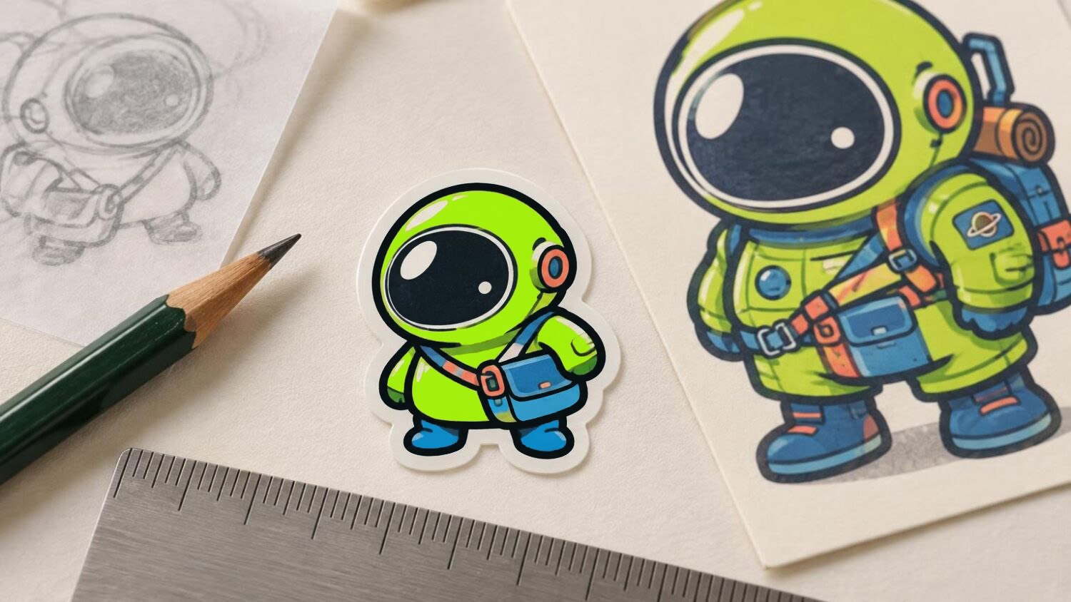
A character can look crisp at 400 percent on your monitor and turn into a dark, uncertain knot at two inches. The working answer is to resize the composition, not merely the file. Protect the one feature that identifies the character, simplify marks that compete with it, and judge the result on a 100-percent paper proof.
To make that process concrete, imagine an original character called the Lantern Hare: a round black rabbit carrying a green lantern. One ear bends into a crescent, while the other stands upright. The coat contains short hatched strokes, the face has two small eyes and a triangular nose, and the lantern throws a hard-edged green patch across the chest.
The bent crescent ear is the meaningful detail to preserve. It identifies the hare before the viewer studies the face. The dense coat hatching is the detail to redraw. It adds atmosphere in a large illustration, but at two inches it risks filling the body with visual grit.
Start with the character’s identifying shape
Before entering a width or resolution, reduce the Lantern Hare to a thumbnail about half an inch tall. This is not a print-ready version. It is a fast recognition test. At that size, ask whether you can identify the round body, the mismatched ears and the lantern as separate shapes.
Ignore eyelashes, fur marks and tiny highlights for the moment. If the character disappears without those details, the main shapes are not carrying enough information. Open the gap between the ears, turn the lantern handle into a clear arc and keep the lantern from merging with the belly. These changes strengthen the drawing at every size.
Small-format artwork often benefits from simplified forms and exaggerated defining details instead of a mechanical reduction. Microsoft’s small-icon design guidance describes the same principle: smaller versions may need fewer details and stronger defining features to remain clear. A sticker is not a software icon, but both ask a compact silhouette to communicate before a viewer inspects its surface.
For another character, the protected feature might be an oversized eye, an unusual hat, a forked tail or a recognizable object held in one hand. Choose one. Trying to protect five equally small signature details usually leaves none of them with enough room to work.
Build the two-inch version as its own drawing
Now place the Lantern Hare inside a box representing the intended finished size. If two inches refers to the maximum width of the die-cut sticker, make the box two inches wide and let the height follow the design’s proportions. Keep the artwork, border concept and any cut-path planning visible together so you are judging the complete silhouette rather than an isolated character.
Scale the original proportionally as a starting point, then stop treating it as untouchable. Inspect the face, the gap between the ears, the space inside the lantern handle and the separation between the lantern and body. These small negative spaces matter as much as the drawn lines. When a gap nearly closes on the proof, widening it is often cleaner than thinning every surrounding stroke.
On the Lantern Hare, preserve the crescent ear but make its bend slightly broader. Keep the green lantern window as one broad fill with a single highlight. Replace the coat’s many short hatch marks with three larger shadow shapes: one under the raised ear, one behind the lantern and one along the lower body. The character still feels dark and furry, but the body no longer buzzes with tiny marks.
The face also needs hierarchy. Keep the two eyes far enough from the outer contour to remain distinct. If the triangular nose and a tiny mouth merge, retain the nose and remove or enlarge the mouth. A face with two readable marks has more expression at sticker scale than a faithful cluster that prints as a spot.
This is where line weight should be judged by function. The outside contour separates the character from its surroundings, so it can carry more weight. Interior lines describe the face, folds and reflected light, so they can be lighter—but they still need enough presence to survive at actual size. Avoid solving every problem by making all lines equally heavy; that flattens the drawing and closes its smallest gaps.
Check the file without confusing pixels with clarity
For raster artwork prepared at 300 pixels per inch, a two-inch-wide image requires 600 pixels across before any printer-required bleed: 2 × 300 = 600. Adobe describes 300 ppi as typical for high-quality commercial print work and explains how physical dimensions, pixel dimensions and resolution are linked. Adobe’s image-size and resolution guide is useful when checking that relationship.
That calculation protects available image data; it does not guarantee that the drawing reads well. A 600-pixel file can still contain cramped eyes, weak gaps or hatching that collapses into a gray patch. Conversely, changing a low-resolution file’s resolution field does not recreate missing detail. Enlarging bitmap artwork requires interpolation, while vector major shapes can scale without the same pixel-based enlargement. Raster effects used inside vector software remain resolution-dependent. Adobe’s explanation of bitmap artwork in Illustrator covers that distinction.
Keep proportions locked whenever you test another size. Stretching a character from two inches to three inches in only one direction changes the drawing instead of testing scale. Also confirm your printer’s current requirements for color mode, bleed, cut paths and accepted file formats rather than assuming one universal setup.
When moving from a paper proof to a custom print order, compare the prepared file with the current artwork requirements for the selected product. CustomStickers provides custom sticker printing and artwork-preparation options that can serve as one production destination.
Run a 100-percent paper proof
A screen preview is helpful for editing, but it is a poor substitute for holding the design at its intended physical size. Adobe notes that on-screen print-size previews are approximate because monitor size and resolution vary. A ruler and a sheet of paper give you a more dependable scale check.
Set up one page containing the Lantern Hare at two inches, 2.5 inches and three inches, with proportions locked. Place a measured reference box beside the versions—one inch square works well—so you can verify that the printer did not silently resize the page.
Use this procedure:
- Duplicate the same current artwork into three size boxes: two inches, 2.5 inches and three inches at the chosen limiting dimension.
- Label each version outside the artwork so the label cannot be mistaken for part of the sticker.
- Add a measured reference box and save or export the proof without changing the page scale.
- In the print dialog, select actual size or 100 percent. Disable fit-to-page, shrink-to-fit and other scaling options. Illustrator’s “Do Not Scale” setting is designed to output artwork at its actual size.
- Print the sheet, measure the reference box and the sticker boxes with a physical ruler, and correct the print setup if they do not match.
- Cut around each proof. A rectangular page leaves too much empty paper around a die-cut silhouette and can make the design feel smaller than it will as an individual sticker.
- Place the cut proofs where the sticker is likely to be seen: on a notebook, backing card, storage sleeve or other intended context. View them first at a natural distance, then bring them closer for a detail check.
Do not use the home print as a verdict on production color, adhesive, finish or cut consistency. Its job is to answer questions about physical scale, visual hierarchy and basic legibility. Once the size and artwork are settled, a production sample can test the actual material and printing result. The checklist in what to inspect on a physical sticker sample covers linework, color, cut edge, finish and readability.
Read the proof in three passes
First, test the silhouette. Turn the proof slightly, place it against a busier surface or look at it without focusing on the face. The Lantern Hare should still read as a round rabbit with mismatched ears and a carried light. If the lantern disappears into the body, enlarge its gap or move it outward rather than adding another outline inside the same crowded area.
Second, test the signature feature. The crescent ear should be visible without close inspection. If it looks like a damaged or folded contour rather than an intentional shape, broaden the inner opening and simplify any fur marks near the bend. Protecting that feature matters more than preserving every stroke from the large illustration.
Third, inspect clutter. Look for facial marks that join, hatching that becomes a dirty patch, narrow openings that appear closed and highlights too small to contribute. Mark the paper directly. Circle each failure and write a plain instruction beside it: “open this gap,” “remove two lines,” “make the highlight one shape” or “move the eye inward.” These are more useful revision notes than “make it clearer.”
Compare the larger versions for useful information
The 2.5-inch and three-inch proofs are not automatic upgrades. They need to earn their extra space. At 2.5 inches, the Lantern Hare might support a small reflection on the lantern glass and a second facial mark without losing its bold shape. At three inches, some coat texture and a thin cast shadow may become readable again.
Ask whether those returning details add expression or story. A reflection that makes the lantern feel luminous may be useful. Six extra fur strokes that merely prove the file contains fur are not. Larger output should reveal meaningful information, not invite every deleted mark back into the drawing.
If the two-inch proof works only when the viewer studies it from a few inches away, it is asking the format to do too much. If it works at a natural glance and rewards a closer look with one or two additional details, the hierarchy is doing its job.
Keep a dedicated small-size master
Save the revised two-inch Lantern Hare as its own master rather than overwriting the large illustration. The large version can keep its coat hatching, tiny mouth and secondary light effects. The sticker version can keep its broader ear opening, simplified shadows and clearer lantern gap.
This is not a lesser copy. It is the version drawn for the distance at which it will be seen. The thumbnail proves the outer idea, the two-inch proof proves recognition and separation, and the larger proofs show whether more space returns details worth keeping.
The final size decision should come from the cut paper in your hand. Preserve the detail that makes the character itself, redraw the marks that become noise, and select the smallest proof that carries the illustration cleanly. For the Lantern Hare, that means keeping the crescent ear, rebuilding the fur as broad shadow shapes and approving two inches only if the ear, lantern and face all remain distinct at 100 percent.