
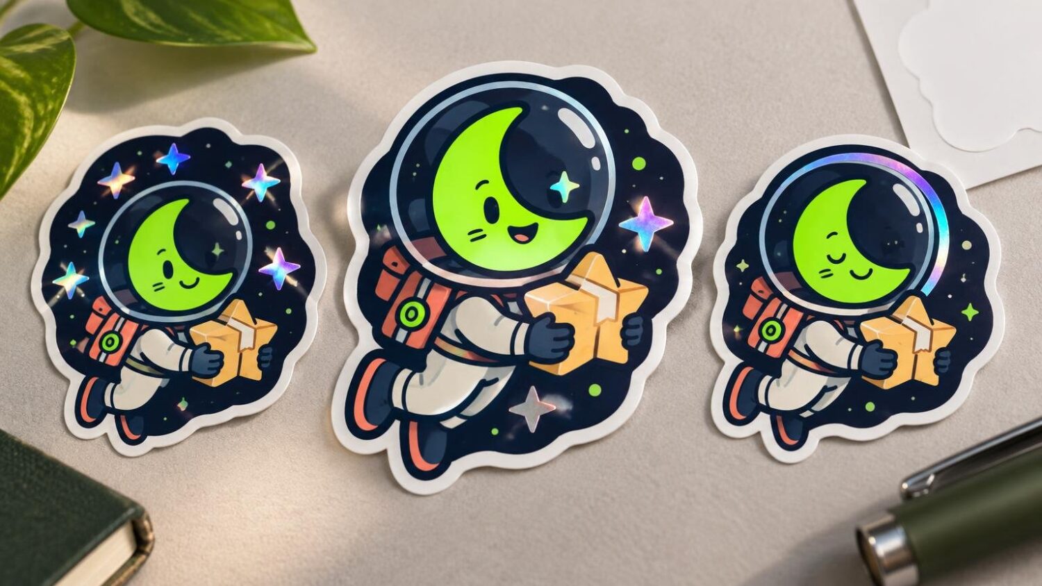
On an illustrated holographic sticker, let the material show through where light belongs in the drawing. For a celestial character, exposed stars are usually the strongest first choice. A narrow trim accent can add a controlled second flash. An entirely open sky makes the biggest spectacle, but it also asks the reflective stock to occupy a large part of the composition.
The face should usually stay white-backed. Eyes, a nose, a small mouth and fine shadow lines need a stable field beneath them. Holographic movement behind those marks can compete with the expression, especially when the sticker turns in the light. White backing beneath the face and its defining details is a supported production approach for preserving opacity, although the exact appearance still needs a physical proof.
Start with one celestial sticker at finished size
Picture a three-inch die-cut sticker called Moon Courier. The character has a pale round face inside a deep-blue hood, a dark open sky behind the head, five small stars and one narrow gold trim line around the hood. The face is the visual landing point. The stars create the sparkle, while the trim connects that sparkle to the character.
Assess this composition at its three-inch finished height, not only while it fills a monitor. If the eyes and mouth already feel delicate at that size, keep them over solid white. The same scale check applies before adding any specialty effect; reducing an illustration for a two-inch sticker shows why small gaps and fine marks often need adjustment rather than simple resizing.
Compare the three places the holographic material could appear
Exposed stars: the clearest use of the effect
Knock the five stars out of both the color artwork and the white-ink mask. Those openings reveal the holographic stock directly. As the sticker moves, each star changes independently while the surrounding navy sky remains solid. The material behaves like light in the scene instead of becoming a filter over the whole drawing.
This treatment also protects the hierarchy. The face remains readable, the hood keeps its shape and the stars provide several small points of movement. Make the stars large and simple enough to survive production. A tiny multi-point star may lose its crisp interior angles once cutting, print registration and reflective texture enter the picture.
An open sky: dramatic, but visually demanding
Removing both color and white coverage from the entire sky creates a broad field of bare holographic stock. This is the brightest option. It can work when the character has a heavy silhouette, a generous opaque border around the face and very little fine detail near the opening.
The risk is competition. Instead of reading as a dark sky containing stars, the background becomes an active rainbow surface. It may pull attention away from the expression and weaken the separation between the hood, face and background. Reflective specialty materials can also make very fine lines and small details harder to read.
There is a useful middle treatment: print dark-blue sky color without white beneath it. The color remains visible, but the reflective substrate influences it. This is not exposed stock. Lighter inks generally reveal more of the holographic effect, while darker color suppresses more of it. A physical sample is the reliable way to decide whether that colored shimmer is restrained enough for the Moon Courier.
One trim accent: controlled movement around the face
The narrow hood trim can carry holographic movement without opening the whole background. Remove the gold color and its white backing if you want bare stock, or keep a light printed color with no white underneath if you want a tinted reflective line. A selected border or graphic area can be assigned to the specialty material while the rest of the illustration remains white-backed.
Keep the accent broad enough to print as a deliberate band. If it becomes a hairline at finished size, the effect may read as uneven registration rather than ornament. The trim should frame the face, not touch the eyes or cut through small facial marks.
| Treatment | Art layer | White-ink layer | Likely visual role |
|---|---|---|---|
| Exposed stars | Stars knocked out | Matching star knockouts | Small, direct flashes that read as light |
| Open holographic sky | Sky knocked out | Matching sky knockout | Largest reflective field and strongest competition |
| Colored reflective sky | Sky color retained | No white beneath the sky | Color influenced by the holographic stock |
| Holographic trim | Trim knocked out or lightly colored | Matching knockout beneath trim | A controlled accent framing the character |
| Face and defining marks | Full face artwork retained | Solid white beneath the artwork | Stable opacity and clearer expression |
Build the art and white-ink layers separately
The file needs to communicate two different decisions. The CMYK art layer says what color prints. The white-ink layer says where an opaque foundation sits between that color and the holographic stock. Removing white alone does not remove the printed color, and removing color alone does not necessarily describe the intended backing.
For Moon Courier, place the complete color illustration on the art layer. On a separate white layer, create solid backing beneath the face, facial marks, hood and any dark sky that should remain opaque. Create matching openings in both layers for the five bare-stock stars. If the trim will also expose the stock, give it the same paired knockout.
A true bare-stock opening contains neither art fill nor white backing. Color artwork without white beneath it produces a different result: the printed color stays present while the substrate affects its appearance. The ILS White Layer Guide illustrates this distinction between artwork, white coverage and exposed specialty material.
Name the layers plainly, such as ART_CMYK and WHITE_INK. Use a contrasting on-screen swatch for the white mask so its coverage is easy to inspect, but follow the printer’s required swatch name, spot-color setup and file format at handoff. Some production workflows require editable vector or layered artwork for white ink and cannot derive the white layer from a flat JPG or PNG.
Prepare the file to the selected printer’s specifications
We suggest CMYK artwork, 300 dpi raster files at ordered size, a one-eighth-inch bleed and a safe area for essential content. Its holographic proof distinguishes visible specialty-stock areas from white-backed areas. Treat those values as printer-specific instructions rather than universal rules; confirm the current template and white-ink conventions for the company producing the run.
If you are still comparing sticker materials and artwork-preparation options, customstickers.com provides a current production destination to review. Whichever printer you choose, ask whether it wants the white mask in the same document, in a separate file or assigned as a named spot color.
Send a small reference image beside the production art. Show the full-color illustration, the white mask by itself and a simple preview labeling “bare holographic stars,” “opaque face” and “holographic trim.” That reference does not replace a correctly built file, but it gives the prepress operator a quick way to catch a reversed mask or a missing opening.
Proof the face, openings and edges
Order a physical sample before committing the whole edition. Tilt it under a fixed light and then turn it slowly. Check whether the eyes remain the first place you look, whether each exposed star has a clean shape and whether the trim reads as one continuous accent. Examine the boundary where white backing meets holographic stock for any distracting halo or shift.
View the sticker at arm’s length as well as close up. The open-sky version may look impressive under a lamp yet lose the character’s expression at normal viewing distance. The star version should keep the face steady while allowing several flashes around it. The trim version should guide the eye inward rather than forming a brighter frame than the illustration can support.
Use the same inspection discipline you would apply when checking a physical sticker sample for linework, color, cut edge, finish and readability. For this project, add one more question: does the holographic movement strengthen the celestial idea, or does it interrupt the drawing?
The best placement for the Moon Courier
Expose the five stars first. They give the stock a clear job, preserve the dark sky and keep the face readable. Add the hood trim only if it remains broad and simple at three inches. Keep solid white beneath the face, eyes, mouth and other identity-carrying marks.
Reserve the fully open sky for a bolder variation with a heavier silhouette and fewer interior details. Selective holographic effects work best when the viewer can tell why each reflective opening exists. On this sticker, the stars are light, the trim is ornament and the face is the character. The layer file should preserve that order.
Frequently Asked Questions
Where should the holographic stock show through on the Moon Courier sticker?
Expose the five stars first. They read as light, preserve the dark sky and leave the face as the visual landing point. Add the hood trim only if it stays broad and simple at the finished three-inch size.
Should the illustrated face have a white backing?
Yes. Keep solid white beneath the face, eyes, mouth and other defining marks so they remain opaque and readable as the sticker moves in the light. Confirm the final appearance with a physical proof.
What counts as a true bare holographic opening?
A bare-stock opening has no color artwork and no white backing. Knock the same shape out of both layers so the holographic material is directly exposed.
Can color print directly over holographic stock?
Yes. Color without a white underbase remains visible while the reflective stock influences its appearance. Lighter inks generally reveal more of that effect, while darker colors suppress more of it.
Why not expose the entire sky?
An open sky creates the largest reflective field, but it can compete with the expression and weaken the separation between the face, hood and background. Reserve it for a bolder variation with a strong silhouette and fewer fine details.
How should the art and white-ink layers be prepared?
Keep the CMYK artwork and white-ink mask separate. Place solid white beneath areas that should stay opaque, then create matching openings in both layers for bare holographic stars and any exposed trim.
What file specifications should I use for a holographic sticker?
Follow the selected printer’s current template. The supplied StickerGiant guidance calls for CMYK artwork, 300 dpi raster files at ordered size, a one-eighth-inch bleed and a safe area for essential content. Confirm its current white-ink and file-format requirements before handoff.
What should I check on the physical proof?
Tilt the sticker under a fixed light and view it both close up and at arm’s length. Check that the eyes remain the first focal point, each star has a clean shape, the trim forms a continuous accent and the white-to-holographic boundaries show no distracting halo or shift.